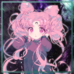
Chibi Angel wrote:D'aawwww thank youuuus! <333 I was thinking about submitting it for the contest but I thought it was a little to bright for the theme. XD
Your welcome!... It doesn't really fit with the death theme but it definitely is Halloween themed!... ^_^ You should submit it anyways...
Here are a couple new sets i have made... Also, on the black&gray set I made an avatar with a transparent background because I have been seeing more of those lately and I really like it... Though I feel like it works better when you put the whole render in it and the render doesn't have any harsh cut off lines... Like, it's a full body render or a chibi render... Oh well, i tried lol... XD
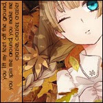
A little advice on Typography. It's generally a good idea to stick with two different types of fonts. Moving to three fonts works pretty good depending on what the GFX piece is. Usually it is best practice not to use more than three different fonts for any reason.
Consider changing the color or how it is emphasized instead.
Heldawn wrote:A little advice on Typography. It's generally a good idea to stick with two different types of fonts. Moving to three fonts works pretty good depending on what the GFX piece is. Usually it is best practice not to use more than three different fonts for any reason.
Consider changing the color or how it is emphasized instead.
Oh okay, I usually don't use more than 2 types of fonts but i was wanting to try something new with that one... Thanks for the feedback... ^_^
This is the signature I was referring to. The typography instead of enhancing the piece makes it looks too busy and takes away from it instead.
What you did with typography on the Alucard signature looks great and adds to it.
I knew which one you were referring to... It is the only one with that many fonts lol... I can see what you mean about it looking too busy but i was happy with it that way... I might go back and change it to see how it looks...