Mike's Attempts at Graphics

Whether you're a writer, cosplayer, crafter, traditional/digital artist or photographer - anything creative is welcome!

Moderators: lolin, PharaohAtem, Sirena

User avatar
Ferefire
Ensouled Member
Ensouled Member
Posts: 48325
Joined: 20 Apr 2003, 19:55
Contact:
Great Britain

Mike's Attempts at Graphics

Post by Ferefire » 06 Apr 2014, 19:20

So, I've been learning photoshop on and off over the last few months. Main reason to create graphics for the events and conventions.


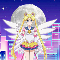
Finished today, has taken about 7 hours of work from start to finish (main pain has been working out the exact composition to get the intended impact of providing information but not in a manner that is not cluttered). 10,000 of these will be printed out -

Image

I shall post what I make in here in the future. It will mostly be flyers, conbook covers and so forth. The focus is on ensuring it appears as professional as possible, so a lot of renders, logos and styles will be deliberately reused for the sake of consistency in branding. (Less is more)
---

User avatar
PharaohAtem
Atem Rank
Atem Rank
Posts: 50645
Joined: 23 Nov 2004, 14:55
Contact:
United States of America

Re: Mike's Attempts at Graphics

Post by PharaohAtem » 06 Apr 2014, 21:05

That actually looks pretty cool. I did a poster once in photoshop. It's the only program I use.
Image

ImageImageImageImageImageImage


User avatar
Expendable
Veteran Member
Posts: 13957
Joined: 08 Apr 2009, 01:29
United States of America

Re: Mike's Attempts at Graphics

Post by Expendable » 11 Apr 2014, 16:13

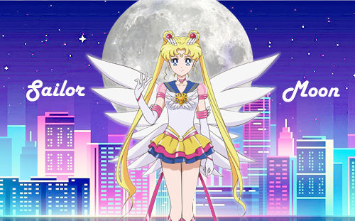
I'm learning GIMP, slowly but surely. I like how you use the solid balloons for the inset pictures and the faded balloons for your text. I think it definitely gets your point across. Interesting text effects on the title.

User avatar
Ferefire
Ensouled Member
Ensouled Member
Posts: 48325
Joined: 20 Apr 2003, 19:55
Contact:
Great Britain

Re: Mike's Attempts at Graphics

Post by Ferefire » 11 May 2016, 18:51

Figured I'd show you all some more recent flyer designs, which by and large show my progress (some assets are shamelessly reused of course) -

Image

Image
---

User avatar
PharaohAtem
Atem Rank
Atem Rank
Posts: 50645
Joined: 23 Nov 2004, 14:55
Contact:
United States of America

Re: Mike's Attempts at Graphics

Post by PharaohAtem » 11 May 2016, 22:20

You can tell you've gotten better. They are bolder and brighter and look cool.
Image

ImageImageImageImageImageImage


MissPurple
Veteran Member
Posts: 2604
Joined: 22 Aug 2008, 17:59

Re: Mike's Attempts at Graphics

Post by MissPurple » 11 May 2016, 22:29

Like what you did with the gaming font for LAGC, not sure on the outline for the Liverpool one, but they're both nice and impactful.

User avatar
Izzy
Veteran Member
Posts: 21254
Joined: 23 Nov 2005, 22:48
United States of America

Achievements

Re: Mike's Attempts at Graphics

Post by Izzy » 16 May 2016, 21:53

I'm inclined to agree with Purple.

Sent from my Z818L using Tapatalk


Play FFXIV? Need a Free Company? Join the Moonlight Warriors on the Jenova Server! PM for more Info!
Play ARK? Need a Tribe? Look for Reina on EU Server 836 on The Island!


Back in the Habit.

User avatar
Ferefire
Ensouled Member
Ensouled Member
Posts: 48325
Joined: 20 Apr 2003, 19:55
Contact:
Great Britain

Re: Mike's Attempts at Graphics

Post by Ferefire » 13 Sep 2016, 02:07

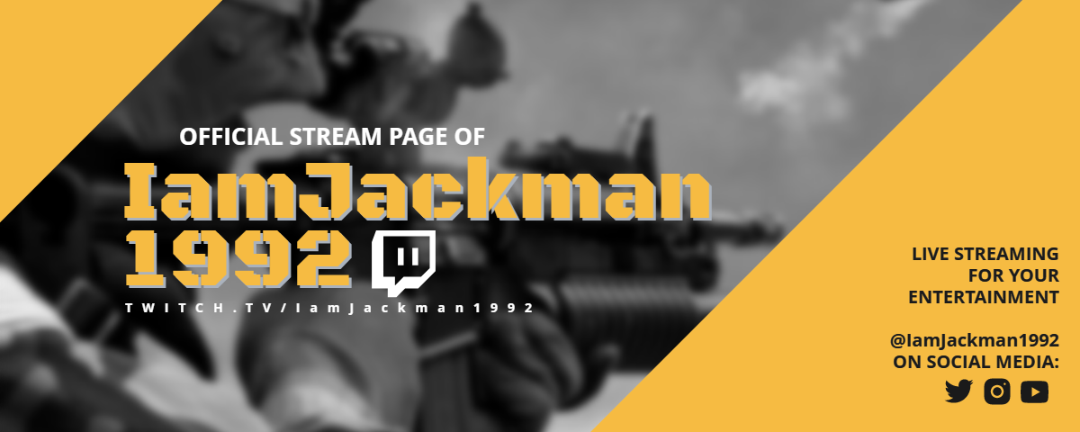
Developing more of a style for the flyers now. The overall focus moving toward a more "fun and stylised" theme that better grabs the audience's attention better, better puts across all necessary information in a more readable style, and is more consistently branded -

Image

As always, the "art of branding" is to be extremely lazy and reuse everything to create a common theme and style. Not quite A6 dimensions, but it'll be an easy rework as I template this bitch up for all the 2017 flyers and promotional materials. :P
---

User avatar
Chibi Angel
Veteran Member
Posts: 13132
Joined: 14 Jul 2005, 23:41
United States of America

Achievements

Re: Mike's Attempts at Graphics

Post by Chibi Angel » 13 Sep 2016, 02:49

Love the improvement over time. Typography has improved immensely which I think has helped a lot. Great work. :)

User avatar
Izzy
Veteran Member
Posts: 21254
Joined: 23 Nov 2005, 22:48
United States of America

Achievements

Re: Mike's Attempts at Graphics

Post by Izzy » 15 Sep 2016, 15:26

I have to agree, You are definitely improving! Keep it up! :)

Sent from my LGL82VL using Tapatalk


Play FFXIV? Need a Free Company? Join the Moonlight Warriors on the Jenova Server! PM for more Info!
Play ARK? Need a Tribe? Look for Reina on EU Server 836 on The Island!


Back in the Habit.

User avatar
Ferefire
Ensouled Member
Ensouled Member
Posts: 48325
Joined: 20 Apr 2003, 19:55
Contact:
Great Britain

Re: Mike's Attempts at Graphics

Post by Ferefire » 20 Sep 2016, 10:18

Thanks. I'll be showing some more graphics later this year. :)
---

User avatar
Chlobo
Pink Member
Pink Member
Posts: 10526
Joined: 07 Sep 2015, 22:53
Contact:
Great Britain

Achievements

Re: Mike's Attempts at Graphics

Post by Chlobo » 22 Sep 2016, 03:26

They look cool.
I thought the birmingham flyers you sent out on Saturday looked pretty awesome too.

User avatar
Ferefire
Ensouled Member
Ensouled Member
Posts: 48325
Joined: 20 Apr 2003, 19:55
Contact:
Great Britain

Re: Mike's Attempts at Graphics

Post by Ferefire » 17 Oct 2016, 04:45

Next generation of flyers created and ready for print (resolution has been lowered to fit on here) -

Image

Image

Image
---

User avatar
King Jackman
Veteran Member
Posts: 2523
Joined: 12 Mar 2016, 20:07
Great Britain

Achievements

Re: Mike's Attempts at Graphics

Post by King Jackman » 17 Oct 2016, 07:42

They've got karaoke on them twice
Image

User avatar
Ferefire
Ensouled Member
Ensouled Member
Posts: 48325
Joined: 20 Apr 2003, 19:55
Contact:
Great Britain

Re: Mike's Attempts at Graphics

Post by Ferefire » 17 Oct 2016, 19:27

Yeah, fixed that just after I uploaded, lol.
---

Post Reply