PharaohAtem's Warehouse of Art
Moderators: lolin, PharaohAtem, Sirena
-
Expendable

- Veteran Member
- Posts: 14289
- Joined: 08 Apr 2009, 01:29
-

Re: PharaohAtem's Warehouse of Art
Beauitiful render, waiting to see how this turns out.
-
PharaohAtem

- Atem Rank

- Posts: 51564
- Joined: 23 Nov 2004, 14:55
- Contact:
-
Re: PharaohAtem's Warehouse of Art
so this was in one of the competition months ago so I wanted a feeling of what is missing and what more I could add to it. I felt like I was missing something.

I also have a few new ones, been so busy just hadn't had the time to do any pics though I've had several cool looking ones I wanted to put together just need to do backgrounds and maybe some boarders and text.

I also have a few new ones, been so busy just hadn't had the time to do any pics though I've had several cool looking ones I wanted to put together just need to do backgrounds and maybe some boarders and text.


-
PharaohAtem
- Atem Rank
- Posts: 51564
- Joined: 23 Nov 2004, 14:55
- Contact:
-
 [/URL
[/URL
Re: PharaohAtem's Warehouse of Art
Maybe hearts and stars?
-
Should Have Bought A V8
Re: PharaohAtem's Warehouse of Art
that Hippy Chick looks fantastic!
Maybe a Rainbow that is transparent and has a gradient?
Maybe a Rainbow that is transparent and has a gradient?
-
PharaohAtem
- Atem Rank
- Posts: 51564
- Joined: 23 Nov 2004, 14:55
- Contact:
-
Re: PharaohAtem's Warehouse of Art
My newest is for halloween. I was thinking that it doesn't need any words on it and should have just left it blank.


-
PharaohAtem
- Atem Rank
- Posts: 51564
- Joined: 23 Nov 2004, 14:55
- Contact:
-
Re: PharaohAtem's Warehouse of Art
Gonna have some new sigs up soon, trying to figure out the text or not to text I'll post something to see which is better.
-
PharaohAtem
- Atem Rank
- Posts: 51564
- Joined: 23 Nov 2004, 14:55
- Contact:
-
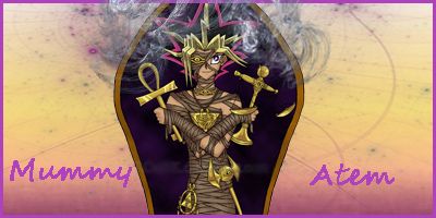
Re: PharaohAtem's Warehouse of Art
Haven't done a set in a while but was working on a sig in something like steampunk. One light one dark which ones the best and do you think I should add writing or leave it as is.
Light Version
[ATTACH=CONFIG]38309[/ATTACH]
Dark Version
[ATTACH=CONFIG]38310[/ATTACH]
Light Version
[ATTACH=CONFIG]38309[/ATTACH]
Dark Version
[ATTACH=CONFIG]38310[/ATTACH]


Re: PharaohAtem's Warehouse of Art
The light one has a better steampunk look.
But the darker one blends the images together better.
Typography adds a little something special to a signature, giving it a unique trait.
But the darker one blends the images together better.
Typography adds a little something special to a signature, giving it a unique trait.


Re: PharaohAtem's Warehouse of Art
the dark one isn't loading for me but the light one looks nice
-
Chibi Angel

- Veteran Member
- Posts: 13132
- Joined: 14 Jul 2005, 23:41
-
Re: PharaohAtem's Warehouse of Art
I really like the light one the best, the space to the left would be a great spot for some typography.
-
PharaohAtem
- Atem Rank
- Posts: 51564
- Joined: 23 Nov 2004, 14:55
- Contact:
-
Re: PharaohAtem's Warehouse of Art
So I'm hoping to add some writting to the first two I did and do a few more pieces, I have a few more steampunk renders that I came across that might work out but I wanna do some holiday ones as well. Once my wrist and shoulder feel better Im sure I'll do more.
-
Expendable
- Veteran Member
- Posts: 14289
- Joined: 08 Apr 2009, 01:29
-
Re: PharaohAtem's Warehouse of Art
Sorry to hear about your wrist, Atem. Personally I prefer the darker one, it makes your subject stand out more. It's a nice combination of elements. From which anime does your subject come from?
-
PharaohAtem
- Atem Rank
- Posts: 51564
- Joined: 23 Nov 2004, 14:55
- Contact:
-
Re: PharaohAtem's Warehouse of Art
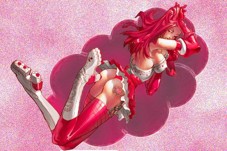
My newest set
[ATTACH=CONFIG]44799[/ATTACH]
[ATTACH=CONFIG]44800[/ATTACH]
[ATTACH=CONFIG]44799[/ATTACH]
[ATTACH=CONFIG]44800[/ATTACH]
-
woostersauce
- Veteran Member
- Posts: 1481
- Joined: 12 Feb 2013, 00:03
Re: PharaohAtem's Warehouse of Art
Oooh I love this! Simple yet elegant.
The render stands out well and it's really nice
The render stands out well and it's really nice